Behind the design: Space Age
Meet Jan Konopka, Rex London designer and creator of some of our favourite designs such as Le Bicycle and Secret Agent. His newest collection is Space Age, a true celebration of science. Here, he shares a little of what went into creating this design.

Jan Konopka. Photo by Antonia Attwood.
I really wanted to create something that honoured humankind's attempt to further understand our planet and the universe, so I came up with the idea of a space design. The Space Age collection was largely inspired by the classic era of space flight and exploration. This year is a great time to expand the range, as it marks 50 years since the moon landings.
Watch how the Space Age design came to life in this behind the scenes video:
Mid-century science books were a big influence on the colours and style of this collection, in keeping with the classic style and feel that Rex London is known for.

Examples of the Soviet imagery and school charts that inspired Jan’s designs.
I started by drawing the astronauts and cosmonauts, and then worked on the rockets and planets.

Early sketches of astronauts by Jan Konopka.
From there I then developed the font and colour palette, and thought about what other interesting design elements I might want to add, such as details about the planets and solar system, for bigger products such as the wall chart, or the puzzle.
We had fun down at the library looking up lots of space related facts, and I even dug out an old school book (Living In Space: A Manual For Space Travellers, by Peter Smolders) for information, as well as design inspiration.

Early sketch of Space Age, showing colours, fonts and ideas for space facts.
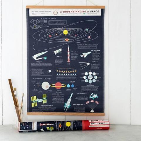
My favourite product so far is the Space Age wall chart. It looks great as an interior design piece for any room, whether it’s a kid’s room, an office, or study.

Space Age wall chart, £16.95
Thank you to Jan for that look behind the Space Age design! There are lots more Space Age products coming soon, and we can’t wait to share them all with you.


